-
Sharing Moonrise
I was milling around the coffee and snacks table at church a few weeks ago when I heard a woman about my mom’s age discussing Moonrise Kingdom. It was her first Wes Anderson, and she was gushing. “Oh, I just saw it too.” I announced, “So good!” She turned to me.
“Oh! But you’re so young. Did you appreciate it?”
I nearly dropped my coffee. Did I appreciate it? I, who nearly went on a Royal Tenebaums location tour of New York with my friends? I, who have watched his entire oeuvre, most of them twice? Didn’t she just say she hadn’t seen anything else by the director?

But she continued: “It reminded me of my youth. My young love. ”
Ah, she’s right. Perhaps I didn’t totally get it. Perhaps young Sam and Susie’s devoted love seemed cute to me, but not as quite as eternally true as it struck this woman. I noticed when we first watched Moonrise that our completely-packed-theatre was full of people of all ages, perhaps a quarter of them over 65. And it’s been fun having a movie to recommend to adults much older than me—I think everyone would love it but perhaps some might truly wallow in nostalgia more than others.
(fun side note for east coasters: it was filmed in Rhode Island!)
Jessica Hische designed the typeface for Moonrise Kingdom. Meaning the first time Wes Anderson dallied away from his first love of Futura bold, he turned to Jessica (click to see her url for the work. It’s funny). Joe and I briefly discussed what accomplishment Jessica could do next that would possibly impress us more. We couldn’t come up with anything.
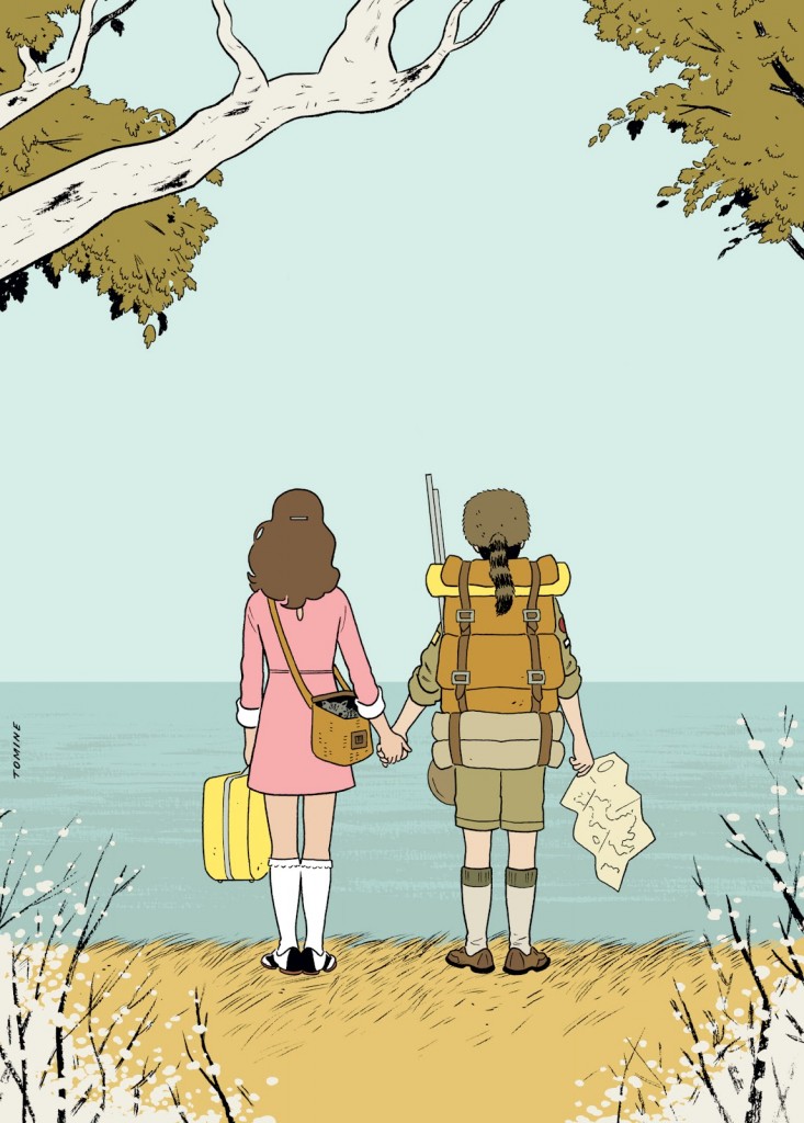
Image by Adrian Tomine for the New Yorker.